Wednesday 28 September 2011

Just a Quick Note

Mat and I have spent a lot of time developing our work for the 3 minute animation over the past few weeks, so I haven't had much time to focus on my Futures work recently.  However, today I aim to get some episode ideas down, as I have all of my character designs finalised and I'm happy with them.

My next main steps for this project are Episode Ideas, Set research and Design, original Merchandise Ideas and the budgeting for the whole series.

I should probably also mention that I decided to go with the FAST FOOD idea, still needs a series title but that can wait for now...as with a lot of things!  I think it has the most potential and is the most unique of my ideas in terms of my class mates' ideas.

Thursday 22 September 2011

Rockpool

A long time since my last post but I'll make this one relatively brief, since it's about an idea that I'm not actually using for my final piece.


The idea is about a rock pool and and old crab who was washed up a long time ago, and I took my main inspiration from octonauts...


Synopsis


Mr. Wilber is an old and wise crab who was washed up into a rock pool many moons ago. He tells the young sea shrimps tales of his time out in the open ocean; battling monstrous creatures and meeting beautiful maidens. The young ones he is telling the stories to re-enact them in a flash back style and change their clothes to fit with the story. 


Here are some character designs I began with, I didn't have a lot of time left so I picked the ones I thought fitted with the idea and began to clean them up and colour them


Here are the finished character designs, with a little bio each


Saturday 10 September 2011

Spore and His Development

It has been a buuuusy few days for me, and I'm preparing to move back to uni tomorrow!! So here's what I have been working on...not much considering the time scale I'm working with, and still one more project to go!


I began with some heads, I had an idea in my head of proportions and shapes so just went with it!


I added some bodies and I gotta say I really liked the right hand one. The shape is great and simple, looks like a young Sprite if I say so myself!  With a more angular head, bolder eyes and smaller nose the character looks younger too, making the character more believable.


Knowing the background/bio of the character I drew him in a suitable action pose 
Then added some colour

Didn't go so well so I experimented a bit
And settled on this one

Then altered the design of the 'blades' of the dandelion seed he is floating with
And finally cleaned it up in the same way as the last character, again with colours complimenting the characters fill colours...with an added bio.


And now on to the final idea! :) for which I have no idea...til next time


Adios! 

Thursday 8 September 2011

Willow

Here is the final design for Willow, the tree sprite.
I used the pen tool for the lines, filling them using the brush pressure option, in a green colour that complimented the character's colours. This was because a black line was too imposing.

Changing my Style

After doing some sketches I developed my ideas and the style seems to have developed along with it!

It's now more like the style of Ben and Holly's Little Kingdom, just not quite as simplified.


Here are the designs for Willow, the main female character.
I think I chose the top left because it is the most suiting to the style and story. The others just look a little scary and wouldn't be suitable for a the series or a younger audience.


Here I did some line work and body development, with the left hand idea being the almost final design. I also changed her ear.

and these are some colour tests, I chose the right hand one. I like the muted pastel colours and think it looks natural for the story line


Wednesday 7 September 2011

Styling Mother Nature

As the title suggests, this blog is going to be all about the style I'm going for.  My main influences have been The Smurfs, Fairly Odd Parents and Louie.  I like the simplicity and strong bold colours they all use and I plan to include this in my designs. I also like the general style of Louie, it has messy lines and an organic feel to it.  I also like the big heads and little bodies of Fairly Odd Parents, again something that I definitely think I want to include in my designs!


Here are some reference images;  


Louie


Fairly Odd Parents


The Smurfs


Now to get some designs of my own done and ready for finalising soon...time's a tickin'!

Mother Nature and Her Little Sprites

I've been pretty busy over the past few days and have finally got a chance to sit down and do some real work! As the blog tittle suggests, this idea is going to be a little more childish than my previous...


Age Group
The age group I am aiming at will be 2-4 and possibly cross over into early 4-8. I think it would be successful as when children are around this age they are most susceptible to learning, and if we can teach them how to look after the planet and living things at a young age then hopefully they can keep this with them when they grow up.


Synopsis
 In each episode we learn about 3 new animals, bugs or insects, how they affect each other and what role we can play to help them; with advice from feeding to homing them. We’ll learn where to find certain animals and how to attract them to your garden, helping them to thrive by providing them with the ingredients they need for survival.  All presented by Willow and Spore, two of natures little helpers.  We’ll see real live footage of the animals and Willow will show you some animations she made providing you with the information on how to help the little critters when they’re in your garden. And with each different season we’ll find new and exciting animals to spot, learn about and help!


I'll blog my style research next! Trying to keep the size of the posts down as they've been pretty mahoosive!

Characters, Their Bios and a Synopsis!

As promised here are my characters with their bios, it also includes a little bit of direction of how the character might develop and progress throughout the series, maybe something like their aims I guess...


Here is the rendered version of one of the drive thru guys that I didn't use, I felt like the character looked too confident to suit his bio.


I also finalised my synopsis for this idea;

We spend some time as a fly on the wall of a popular fast food restaurant, creating a documentary about the employees who work there. We film them as they go about their daily routines and grow to love or loathe them as we learn more about them and their aspirations. We see them working in action and interview them each day to see how they are progressing.  However a visit from the health standards agency and an unforeseen procedural error could see the restaurant closed down before the end of the shooting.


Tuesday 6 September 2011

Some Greasy Characters

Well here are the main characters for my Fast Food Restaurant Mockumentary idea.  I have a total of 6 that would make regular appearances throughout the series.


It's going to be a very big post so I'm going to split it up into a couple of smaller ones!


Here goes...
For this post I'll show you my developmental work and my chosen designs.
As I said I have 6 main characters, a manager, checkout operator, fryer worker, new starter and 2 drive thru workers, and here they are.

 So...top left we have the manager, I drew her head and was very happy with it so I experimented with her body to suit her personality and face. 


Top right is the checkout operator, I was overall very happy with the design straight away and only changed her trousers to a skirt in the final design.


Middle left is the fryer worker, I was trying to capture a dumb looking character who quite clearly eats in too often. I think I achieved it with the bottom of the 3 characters and you can see in the final designs below.


Middle right is the new starter, I wanted a young guy for this, just out of school and innocent looking. I was going to go with the top of the 3 designs but decided that the middle one would suit the character better, looking more like a teenager than a young child.


The bottom 2 are the drive thru workers, the left is the fatter of the 2, slightly high looking and will do anything for the right price. For the one on the right I went with the head shown here originally but later decided to change it to the top right of the 4 designs, as you can see below in the final concepts.  The two go together like dumb and dumber!


As mentioned above, here are my final designs in the style I mentioned in my previous post.

Monday 5 September 2011

Style

In terms of style research I had a very clear idea in my head of how it would look, and I have to say I hit the nail on the head with my designs.  I am really pleased with them and think that the style definitely suits the ideas behind the series and what I had in my head...which doesn't happen often!


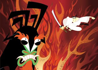
I took my main style inspiration from some shows I remember watching when I was younger, the Mr Bean animated series, Ed, Edd and Eddy and Samurai jack


With the heavy outline to the character and subtler lines inside for the features and any clothing etc. the image appears to have more depth, containing more detail in the foreground than the background.


These guys were my main inspiration for 2 of my characters.


I like the style of Samurai Jack because it is simple yet effective.  There is little to no shadowing for the most part but still work really well on a definite 2D level.

Some modern day style inspiration came from the League Of Super Evil, The characters are all so different and quirky...that's what I attempted to achieve with mine.


I also stumbled across this blog whilst trying to find some style research. It's a great little blog by someone in a similar situation to me, here are some of her images that inspired my chosen style.


I'll post all of my character designs with development and bios by the end of tomorrow!